Hash Bar
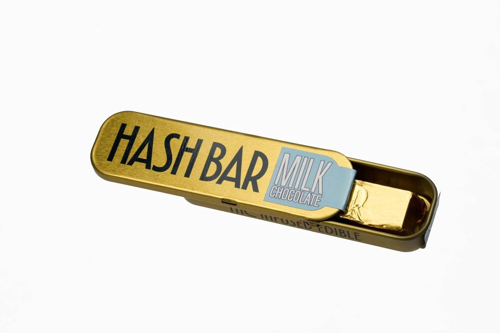
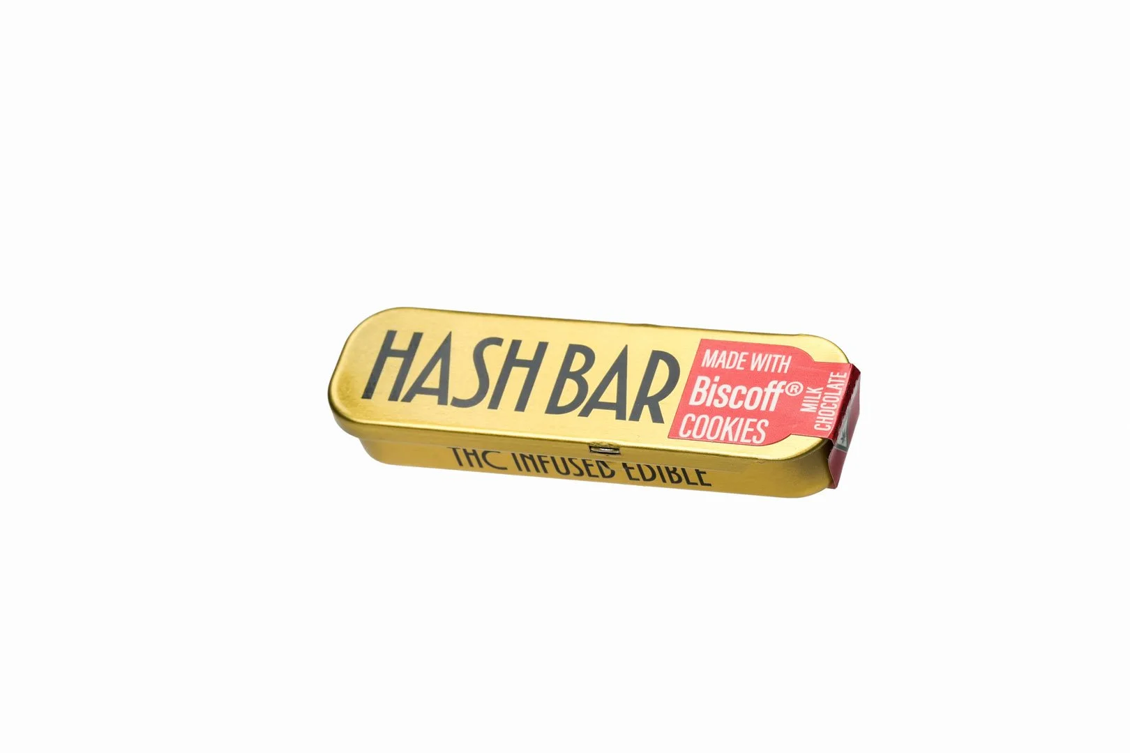
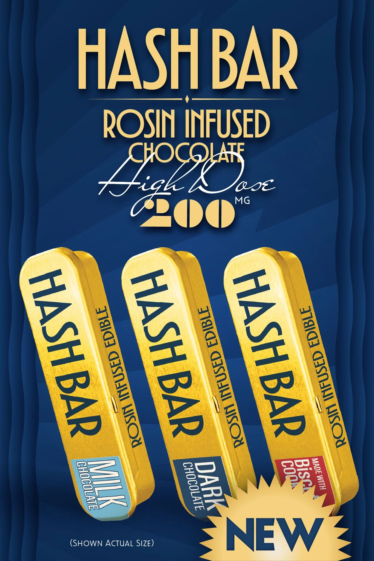
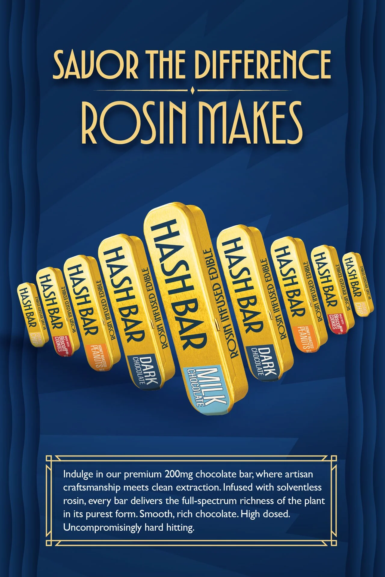
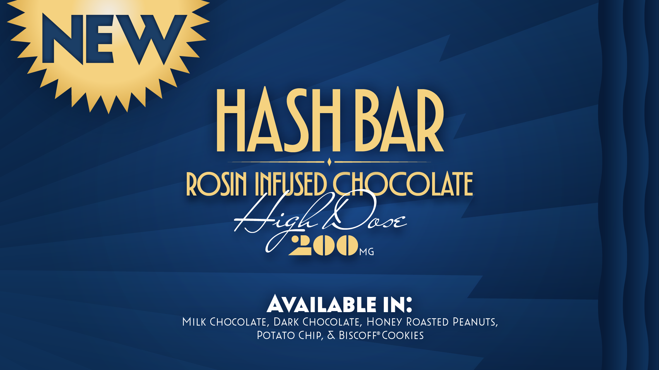
Leading up to the launch of their high quality, high dose Hash Bar chocolate edible, Lion Labs reached out to me to help fine tune the design of the package and advertising campaign.
BEFORE

AFTER
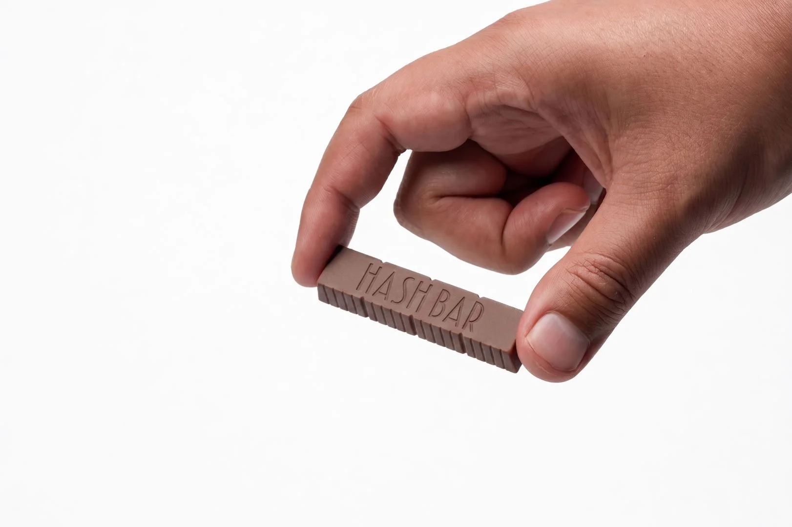
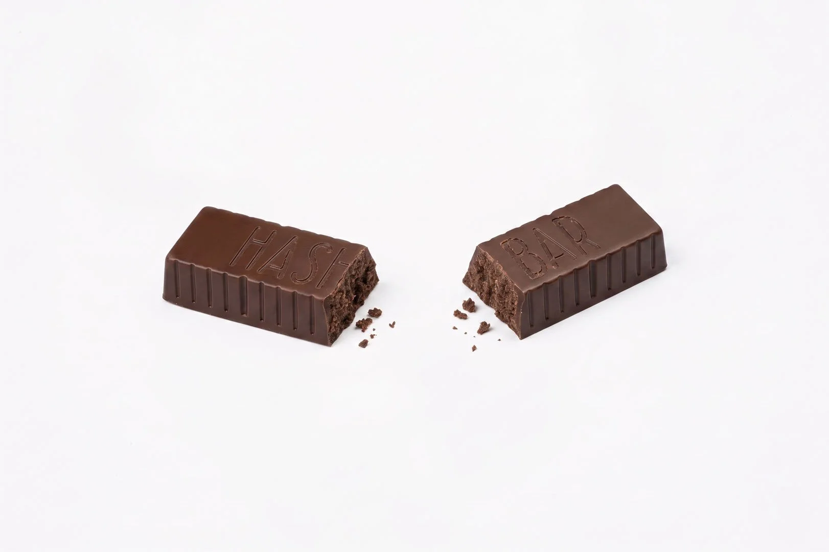
Their existing design had promise, but the marketing team wasn’t completely satisfied. It was unclear who the product was for, and the typeface read as Wash Bar to some. They really just wanted me to choose a new font and make it easier to read six feet behind a sales counter.
Taking inspiration from the original condensed monoline that seemed to reference art deco, I decided to go for a more classic period typeface to represent the luxury experience and higher price point of the product.